Service
Packaging, Visual Identity, Logo
Year
2012
The assignment was to make a packaging for traditional sweets known from a certain part of Croatia – the Dalmatian coast and islands.
The product was designed as a souvenir, so the target groups were foreigners and tourists.
The brand has three extensions which are coded by color and illustration.
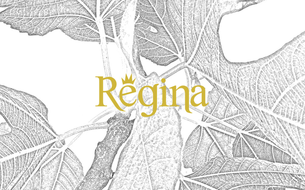
The meaning of Regina in Latin is queen and therefore it seemed even more appropriate for a candy brand since candy was always more oriented towards women.
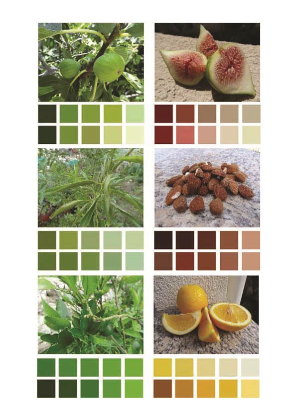

Color picking for the three extensions was derived from the photos of the main ingredient of the product.
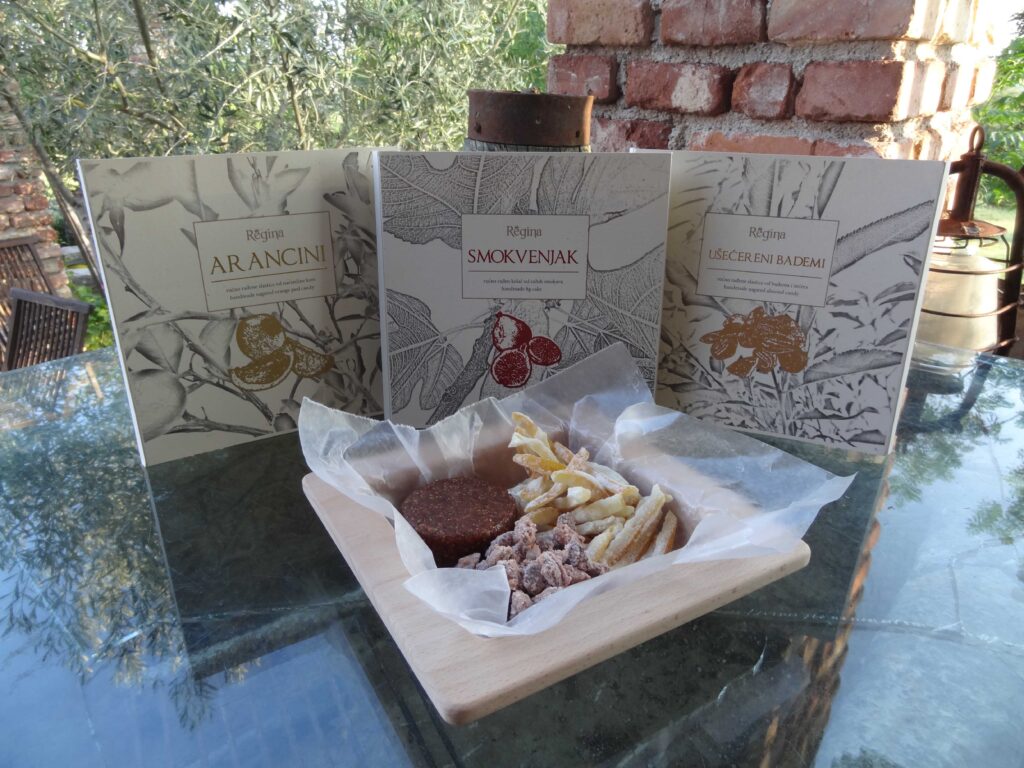
Since all three candies are handmade, the intention was to keep the packaging as traditional as possible, but also give it a modern and exclusive look.
The packaging also includes a hand-made, wooden container that not only has a function in packaging but also finds its purpose in serving the candy.
Since the product was meant to gain a luxurious packaging and design, the colors were given a metallic shine. So from a yellow, brown and a dark red color the label was in gold, bronze and a shinny dark red giving the product a more prestige look.