Client
Ured Bastion Dizajn d.o.o.
Services
Visual Identity, Branding, Logo
Year
2015
Bastion Dizajn d.o.o. is an office that deals with professional spatial arrangement – design, construction, use and removal of buildings. In addition, it also supervises construction.
The definition of the word ´Bastion´ represents an angular structure designed outside the artillery fortification. A fully developed bastion consists of two front walls and two side walls. The bastion is one of the dominant architectural elements from the mid-16th century to the mid-19th century. There are several different types of bastions: solid, hollow, flat, truncated, composite, plain, deformed, half-bastion, double, semicircular, and circular.
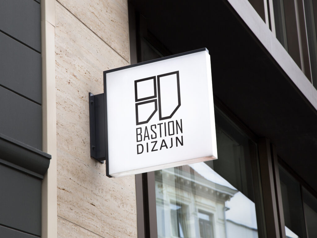
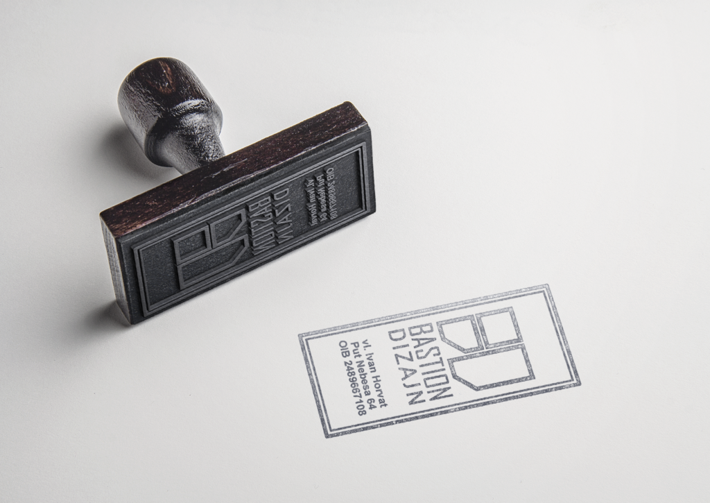
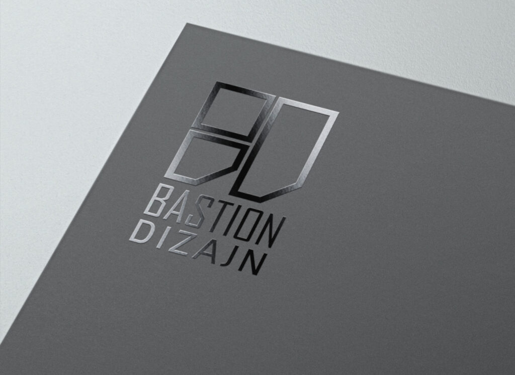
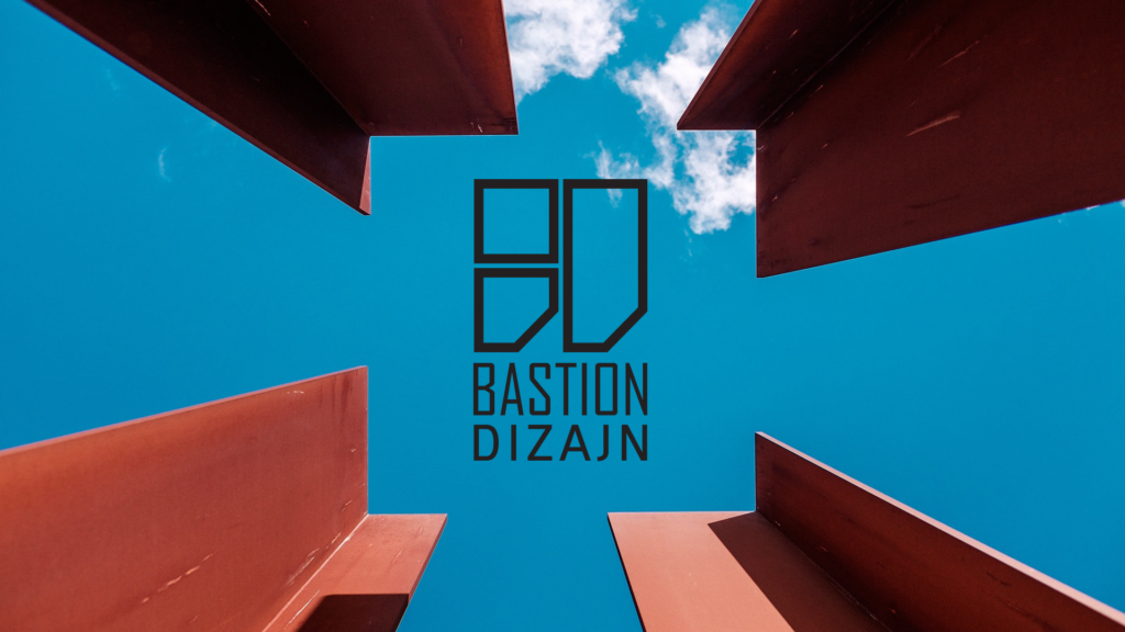
The logo is a combination of the typographic solution and the initials of the company. The logo can be used as a combination of the above or only as initials.
Together, the logos form one composition made up of several elements.
The way of using angular lines as well as the angular font derives from the link with the characteristics of the bastion as well as the company’s activity itself – solid and solid structures, designing constructions, closing or creating space.
